


Bootstrap markup. shadcn feel.
Moo UI is a Bootstrap 5.3-native component system with a restrained, shadcn-inspired visual language.
Explore the catalog » · Try it in 30 seconds · Report an issue
Moo UI gives Bootstrap 5.3 applications a calmer, shadcn-inspired product surface without asking teams to abandon the markup, variables, and plugin contracts they already use.
It is built for server-rendered products, admin screens, dashboards, and SaaS interfaces where Bootstrap remains the public contract but the default visual language needs to feel more current.
- Bootstrap-native. Keep familiar classes, form markup, layout utilities, and Bootstrap JavaScript where Bootstrap already owns the behavior.
- CSS-first. Most components need only one stylesheet and ordinary HTML.
- Gradual when needed. Use the full build or scope Moo UI inside a
.moo-uiboundary while an existing Bootstrap app migrates piece by piece. - Explicit runtime. Optional Moo UI behavior loads through ESM entrypoints only when a component needs behavior Bootstrap does not provide.
The quick demo intentionally follows the floating npm tag:
<link rel="stylesheet"
      href="https://unpkg.com/@wpmoo/ui@latest/dist/assets/css/moo-ui.css">

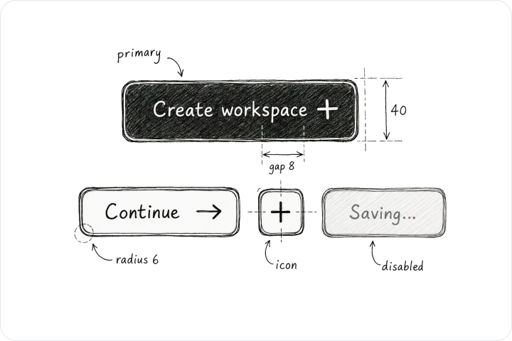
<button type="button" class="btn btn-primary">Create workspace</button>
moo-ui.css is a complete Bootstrap CSS build with Moo UI defaults. Use it
instead of another Bootstrap stylesheet, not in addition to one.
It emits Moo UI's root/body theme tokens before Bootstrap's reboot body rules;
if you persist dark or system mode, set data-bs-theme synchronously in the
head before this stylesheet loads.
Local development candidates use separate tarballs. Public install and license links refer to the published stable release.
npm install @wpmoo/ui bootstrapUse the complete Moo UI Bootstrap build instead of Bootstrap's stylesheet:
import "@wpmoo/ui/moo-ui.css";
import "bootstrap/dist/js/bootstrap.bundle.min.js"; // only when plugins are usedKeep the existing Bootstrap stylesheet, load the scoped Moo layer after it, and wrap only the area being migrated:
import "bootstrap/dist/css/bootstrap.min.css";
import "@wpmoo/ui/moo.css";
import "bootstrap/dist/js/bootstrap.bundle.min.js"; // only when plugins are used<div class="moo-ui">
<button type="button" class="btn btn-primary">Create workspace</button>
</div>Resolve the initial light or dark value on the server whenever the host
knows the request or session preference. Put it on the first application owner;
keep lang and the document's default dir on html:
<!-- Server-resolved document: no state bootstrap required. -->
<html lang="en" dir="ltr">
  <body>
    <div class="moo-ui" data-bs-theme="dark" data-moo-document-owner="true">
      <!-- Moo UI application -->
    </div>
  </body>
</html>
For a static or strict-CSP host without an inline bootstrap, keep the classic external asset as the root's first child. An embedded owner uses explicit keys when it needs independent browser persistence:
<!-- Static or strict-CSP fallback: classic script is the root's first child. -->
<div class="moo-ui" data-bs-theme="light" data-moo-theme-key="portal:theme">
  <script src="/vendor/@wpmoo/ui/state.js"></script>
  <!-- embedded Moo UI fragment -->
</div>
On a first visit, a static host without a known server preference can only
correct a browser-only preference after the external asset is fetched, so that
correction may be visible. The server value remains the deterministic fallback;
an external fetch cannot guarantee zero flash in this profile. Since RC9, Moo UI exposes
this asset as @wpmoo/ui/state.js.
import MooUI from "@wpmoo/ui/moo-ui.js";

const combobox = document.querySelector(".combobox");
if (combobox) {
  MooUI.Combobox.getOrCreateInstance(combobox);
}
The runtime bundle is optional and side-effect-free. Import the aggregate
@wpmoo/ui/moo-ui.js entrypoint, or import only the component module you use.
Chart consumers install the optional peer explicitly (other components need no Chart dependency):
npm install chart.js@4.6.1Chart.js supplies its own @kurkle/color dependency and vendor licenses. Neither
implementation is embedded in Moo UI's npm archive. Bundlers resolve chart.js/auto
from that installation. Native browser/CDN hosts must configure the version-pinned
import map in the Installation guide before
loading MooChart. Self-hosted vendors must retain their upstream license files.
The aggregate loads Chart.js only when loadChart() is called:
const chartRoot = document.querySelector(".chart");
if (chartRoot) {
  const Chart = await MooUI.loadChart();
  Chart.getOrCreateInstance(chartRoot);
}
RC10 replaces the aggregate's synchronous Chart export with the asynchronous
loadChart() loader, also available as a named export. Both aggregate variants
resolve the adjacent chart.js asset, so keep that file beside the aggregate
when self-hosting. Repeated loader calls and direct chart.js imports share
the same constructor. The standalone chart.js and chart.min.js APIs remain
synchronous and unchanged.
See the Installation guide for npm, CDN, Sass, Bootstrap JavaScript, and ESM recipes.
For server-marked Sheets, call the explicit initializer after Bootstrap Offcanvas is available on the document's window:
import { initSheets } from "@wpmoo/ui/sheet.js";
initSheets(document);
For a non-modal floating Card, initialize the optional controller explicitly:
import FloatingPanel from "@wpmoo/ui/floating-panel.js";
const panel = FloatingPanel.getOrCreateInstance(document.getElementById("onboarding"));
// panel.dispose(); // release listeners and restore the original hidden/ARIA state
Use an id on the data-floating-panel element. Plain buttons target that id with
data-floating-panel-open or, inside the panel, data-floating-panel-dismiss.
Controls share the panel's nearest .moo-ui boundary. An optional
data-floating-panel-key remembers dismissal in browser local storage; use an
application-owned, account-specific key when appropriate. This is a local UI
preference, not authorization or server-side task state. See the
Card example for markup.
For the Image Gallery block, bind its lightbox after Bootstrap's Modal and Carousel are available on the document's window:
import { initImageGalleries } from "@wpmoo/ui/image-gallery.js";
const release = initImageGalleries(document);
// release(); // remove the listeners again
Without the module every thumbnail still links to its large image. With it the lightbox opens at the clicked photo, keeps the counter and caption current, runs the slideshow and full-screen buttons, adds arrow keys and loads only the current photo and its neighbours. See the Image Gallery block for markup.
For the Consent block, bind the card once per document. Gated scripts,
frames and images carry data-consent-category and data-consent-src and
are activated only after their category is granted:
import { initConsent } from "@wpmoo/ui/consent.js";
const consent = initConsent(document);
consent?.whenGranted("statistics", () => loadStatistics());
document.addEventListener("moo:consent:change", (event) => console.log(event.detail.choices));
Without the module the card stays hidden and nothing optional loads. The
choice is stored in a first-party cookie with the configuration revision and
a time stamp; consentRevision(categories, reask) computes that revision.
Adding or removing a category or service asks again; for a material change
to a service's provider, purpose or storage, raise reask. Withdrawal removes
declared first-party cookies on the root path and storage keys; cookies set on
another path or by another host cannot be removed by the page.
See the Consent block for markup.
For an opt-in document overlay scrollbar, load the stylesheet first and pass the resolved page theme owner explicitly:
import OverlayScrollbar from "@wpmoo/ui/overlay-scrollbar.js";
const scrollbar = OverlayScrollbar.getOrCreateInstance(document.querySelector(".moo-ui"), {
  label: "Page scroll position", // supply a localized accessible name
  hideDelay: 900,
});
// scrollbar.refresh(); // after host geometry changes
// scrollbar.dispose(); // restore the native scrollbar
For dependency-free password requirements feedback, initialize an identified
fieldset[data-password-requirements] explicitly:
import PasswordRequirements from "@wpmoo/ui/password-requirements.js";
const feedback = PasswordRequirements.getOrCreateInstance(
  document.getElementById("password-rules"),
);
await feedback.ready;
// feedback.dispose(); // restore original markup, attributes and control state
The Field example
shows the rendered contract. Policy version3 supports length, maximum, case,
number and symbol requirements, plus optional confirmation and submit binding.
All controls share a form and nearest .moo-ui owner. Submit feedback requires
Bootstrap Tooltip on that document's window. There is no bundled estimator,
strength score, breached-password lookup, network request or storage access.
Meeting these checks does not establish password strength or replace server
validation. A trusted host may supply synchronous analyze(value), returning
{met: boolean, score: 0..4}; this callback receives the normalized password and
owns its security/privacy behavior. Without it no score is produced. onChange
receives only Boolean check states, an active flag and the optional host score.
See the public policy contract.
The module preserves native document/touch/wheel scrolling. Its thin thumb
appears while scrolling, near the trailing mouse edge or on keyboard focus;
show/hide never reserves a layout gutter. Initial activation removes any native
gutter. The shared state.js bootstrap hides the native document scrollbar
before first paint for the explicit data-moo-document-owner="true" owner.
This default also applies when the optional overlay is not initialized; native
touch, wheel and keyboard scrolling remain available. Embedded owners do not
affect document scrollbars. Overlay initialization takes
over that initial state; disposal restores the host's original native visibility.
By default it controls the standards-mode document. Pass
scrollElement: element for an existing native scrolling region belonging to
the same theme owner; the catalog uses this for its Page main region. There is
one instance per scroll target, without replacing or wrapping that target.
Printing, forced colors and horizontal overflow use the
native scrollbar instead. It does not initialize merely by importing the module.
- Keep server-rendered HTML, Bootstrap classes, and familiar plugin behavior.
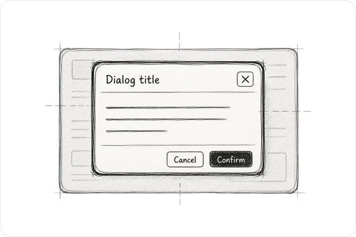
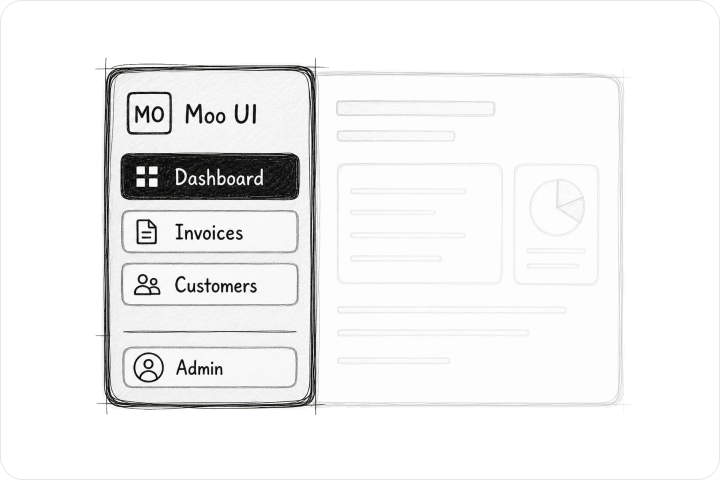
- Apply a restrained product rhythm to forms, overlays, navigation, data display, and application shells.
- Inspect static rendered examples and copy the resulting HTML contracts.
- Start with one scoped region or replace the full stylesheet after review.
Browse the component catalog, composed blocks, and full examples.
Moo UI is tuned for product interfaces: compact controls, quiet cards, predictable overlays, readable forms, and data-heavy screens that still feel calm.
The 2.3.0 minor release adds the Consent block: a first-visit consent card
with categories and services, a settings trigger, an embed placeholder and a
policy table, with the optional @wpmoo/ui/consent.js module that stores the
choice in a first-party cookie and loads gated scripts, frames and images only
after consent. Accordion items gain an optional action beside the trigger.
The 2.2.0 minor release adds the Item component, Image Gallery and Video
Dialog blocks, and component usage guides. Image Gallery includes five layouts,
a lazy-loaded lightbox, slideshow and full-screen controls through the optional
@wpmoo/ui/image-gallery.js module. The catalog adds structured metadata,
content-derived page dates and a browsable sitemap.
The 2.1.1 patch release improves Chart tooltips, DataTable sorting
and selection, Combobox input, Context Menu disposal, Date Picker controls,
and Sidebar keyboard navigation. Page titles follow their owner heading weight.
The 2.1.0 minor release adds host-translated password feedback, the
--moo-heading-font-weight owner token, and a document scrolling mode for
website shells. The Layout catalog demonstrates the document mode with a live
preview and copyable example. Chart consumers use the optional Chart.js peer
or a native browser import map.
Component certification remains
preview, with its documented manual and browser/device limits. Public exports, package boundaries, browser support, and release evidence live in Support & Evidence.
Complete release notes are on
GitHub Releases.
Small documentation corrections, reduced reproductions, accessibility checks, and bounded component improvements are welcome. The Contributing guide covers local development, project boundaries, workflow, and issue types.
Development setup and repository boundary notes live in the Contributing guide. Consumer install paths live in the Installation guide.
Moo UI source code is MIT licensed. License details live in LICENSE and the License page. Third-party distribution details and notices are kept separately in THIRD_PARTY_NOTICES.md. Catalog visual assets and their license are repository-only and are not included in the npm package. Asset terms live in the visual asset license.