Skip to content

Vertically center the condensed badge count in the LHN tab pill - #100443

Open
MelvinBot wants to merge 1 commit into
mainfrom
claude-lhnUnreadBadgeVerticalCenter
Open

Vertically center the condensed badge count in the LHN tab pill#100443
MelvinBot wants to merge 1 commit into
mainfrom
claude-lhnUnreadBadgeVerticalCenter

Conversation

@MelvinBot

@MelvinBot MelvinBot commented Sep 5, 2026

Copy link
Copy Markdown
Contributor

Explanation of Change

The unread count in the LHN tab pill renders too high on iOS and Android.

Three styles in src/styles/index.ts combine to cause it:

  • badgeText spreads lineHeightBadge, which sets lineHeight: 16.
  • condensedBadgeText overrides fontSize down to 9 (fontSizeExtraSmall) but leaves that inherited lineHeight: 16 in place.
  • tabSelectorBadge set height: 16, which defaultBadge's borderWidth: 1 shrinks to a 14px content box.

So a 9px glyph sits in a 16px line box inside a 14px container. Web is fine because CSS splits the 7px of leading symmetrically. Native does not — iOS approximates the correction with NSBaselineOffset, and Android's CustomLineHeightSpan splits the leading ceil above / floor below on top of includeFontPadding: true. alignItems: 'center' has no slack left to fix it, and justifyContent: 'center' acts on the horizontal axis here because defaultBadge sets flexDirection: 'row'.

This PR makes two changes:

  1. condensedBadgeText now sets lineHeight: undefined, so the digit centers on its own font metrics instead of inside an oversized line box. This is the same fix already used by buttonText, avatarInnerTextSmall, and headerEnvBadgeText in this file. Scoping it to condensedBadgeText rather than badgeText keeps the blast radius to condensed badges only.
  2. tabSelectorBadge now uses minHeight: 16 instead of height: 16, so the pill can't clip its own content when the OS font scale is above 1. condensedBadge already uses minHeight: 16, so this makes the two consistent.

Other places that use this same badge config and should show the same improvement: the To-dos LHN tab (src/pages/inbox/sidebar/InboxTabSelector.tsx) and the Search narrow type menu (src/pages/Search/SearchTypeMenuNarrow.tsx).

Fixed Issues

$ #100397
PROPOSAL: #100397 (comment)

Tests

These steps apply to iOS: Native and Android: Native.

Precondition: the account has a few unread messages, a few to-dos, and a few draft reports.

  1. Log in to a user account.
  2. Go to Inbox.
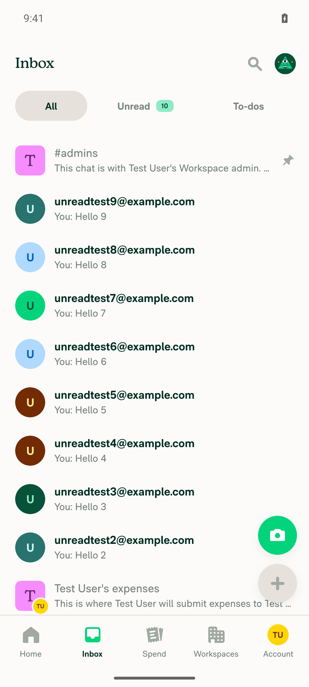
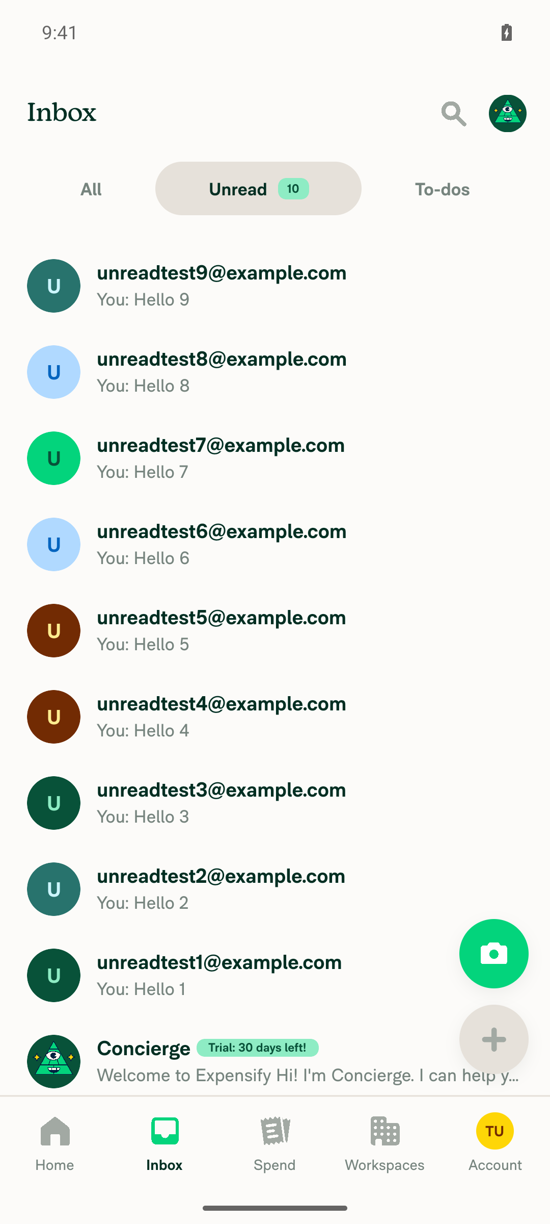
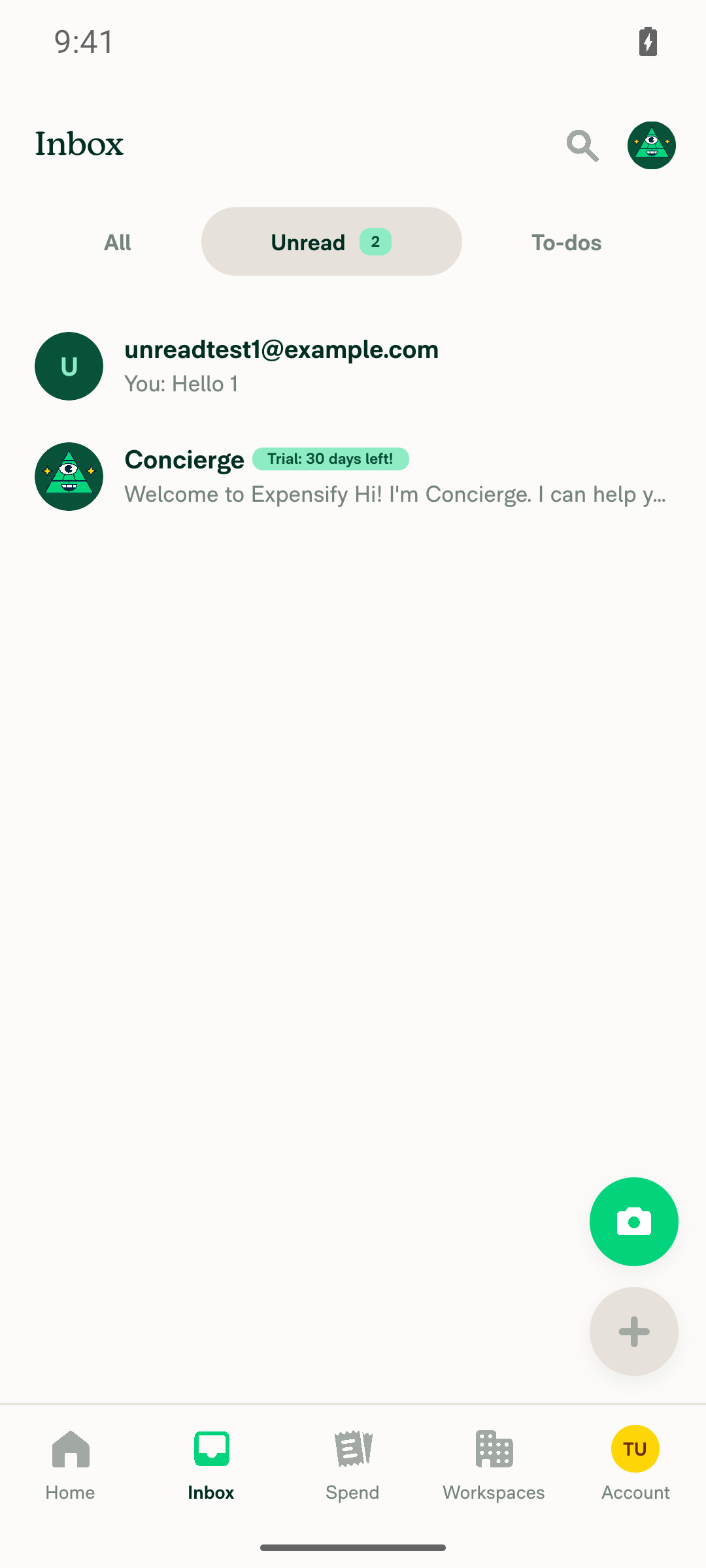
  3. Verify that the Unread tab message counter is vertically centered in the pill.
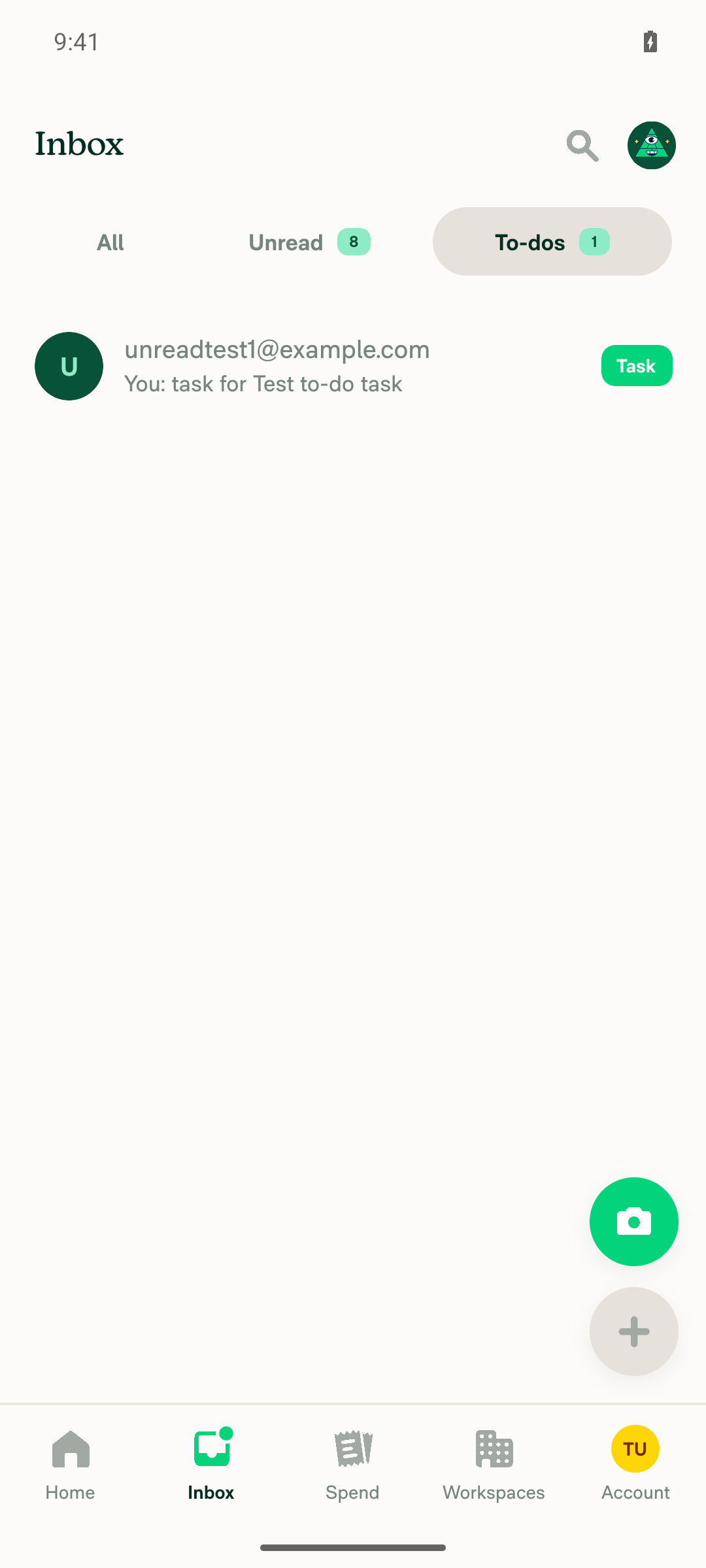
  4. Verify that the Todos tab message counter is vertically centered in the pill.
  5. Go to Spend.
  6. Verify that the Drafts report counter is vertically centered in the pill.
  • Verify that no errors appear in the JS console

AI Tests

Run locally by MelvinBot on this branch (Expensify/App required-local bundle from the test-selection-matrix, plus the path-gated style check):

Check Result
npm run lint-changed ✅ pass
npm run typecheck ✅ pass
npm run spell-changed ✅ pass
npm run gh-actions-unused-styles (scripts/findUnusedStyles.ts) ✅ pass — no unused styles
npm run storybook -- --smoke-test --ci ✅ pass
npm testtests/ui (247 suites) ✅ pass
npm testtests/actions + tests/navigation (131 suites) ✅ pass
npm testtests/unit (~972 suites, run in 4 alphabetical chunks to stay inside the runner time limit) ✅ pass

Prettier was covered through npm run lint-changed — this repo has no standalone prettier npm script, and formatting is enforced by ESLint.

The test steps above were also run end to end by MelvinBot on Android: Native (all 6 steps passed) and on web as a no-regression check. iOS: Native still needs a human check, as does behaviour at an enlarged OS font scale on both native platforms.

Offline tests

QA Steps

Same as tests.

  • Verify that no errors appear in the JS console

PR Author Checklist

  • I linked the correct issue in the ### Fixed Issues section above
  • I wrote clear testing steps that cover the changes made in this PR
    • I added steps for local testing in the Tests section
    • I added steps for the expected offline behavior in the Offline steps section
    • I added steps for Staging and/or Production testing in the QA steps section
    • I added steps to cover failure scenarios (i.e. verify an input displays the correct error message if the entered data is not correct)
    • I turned off my network connection and tested it while offline to ensure it matches the expected behavior (i.e. verify the default avatar icon is displayed if app is offline)
    • I tested this PR with a High Traffic account against the staging or production API to ensure there are no regressions (e.g. long loading states that impact usability).
  • I included screenshots or videos for tests on all platforms
  • I ran the tests on all platforms & verified they passed on:
    • Android: Native
    • Android: mWeb Chrome
    • iOS: Native
    • iOS: mWeb Safari
    • MacOS: Chrome / Safari
  • I verified there are no console errors (if there's a console error not related to the PR, report it or open an issue for it to be fixed)
  • I followed proper code patterns (see Reviewing the code)
    • I verified that comments were added to code that is not self explanatory
    • I verified that any new or modified comments were clear, correct English, and explained "why" the code was doing something instead of only explaining "what" the code was doing.
    • I verified any copy / text that was added to the app is grammatically correct in English. It adheres to proper capitalization guidelines (note: only the first word of header/labels should be capitalized), and is either coming verbatim from figma or has been approved by marketing (in order to get marketing approval, ask the Bug Zero team member to add the Waiting for copy label to the issue)
  • If a new code pattern is added I verified it was agreed to be used by multiple Expensify engineers
  • I followed the guidelines as stated in the Review Guidelines
  • I tested other components that can be impacted by my changes (i.e. if the PR modifies a shared library or component like Avatar, I verified the components using Avatar are working as expected)
  • If a new CSS style is added I verified that:
    • A similar style doesn't already exist
    • The style can't be created with an existing StyleUtils function (i.e. StyleUtils.getBackgroundAndBorderStyle(theme.componentBG))
  • If new assets were added or existing ones were modified, I verified that:
    • The assets are optimized and compressed (for SVG files, run npm run compress-svg)
    • The assets load correctly across all supported platforms.
  • If the PR modifies code that runs when editing or sending messages, I tested and verified there is no unexpected behavior for all supported markdown - URLs, single line code, code blocks, quotes, headings, bold, strikethrough, and italic.
  • If the PR modifies a generic component, I tested and verified that those changes do not break usages of that component in the rest of the App (i.e. if a shared library or component like Avatar is modified, I verified that Avatar is working as expected in all cases)
  • If the PR modifies a component related to any of the existing Storybook stories, I tested and verified all stories for that component are still working as expected.
  • If the PR modifies a component or page that can be accessed by a direct deeplink, I verified that the code functions as expected when the deeplink is used - from a logged in and logged out account.
  • If the PR modifies the UI (e.g. new buttons, new UI components, changing the padding/spacing/sizing, moving components, etc) or modifies the form input styles:
    • I verified that all the inputs inside a form are aligned with each other.
    • I added Design label and/or tagged @Expensify/design so the design team can review the changes.
  • I added unit tests for any new feature or bug fix in this PR to help automatically prevent regressions in this user flow.
  • If the main branch was merged into this PR after a review, I tested again and verified the outcome was still expected according to the Test steps.

Screenshots/Videos

Android: Native
Android: mWeb Chrome
iOS: Native
iOS: mWeb Safari
MacOS: Chrome / Safari

Co-authored-by: Roji Philip <rojiphil@users.noreply.github.com>
@MelvinBot
MelvinBot requested a review from a team September 5, 2026 17:52
@melvin-bot melvin-bot Bot added Melvin-Test-Android Melvin-Test-Web Triggers Melvin to run the testing steps of the PR on web labels Sep 5, 2026
@MelvinBot

MelvinBot commented Sep 5, 2026

Copy link
Copy Markdown
Contributor Author

🤖 Web test steps verification results: ✅ pass

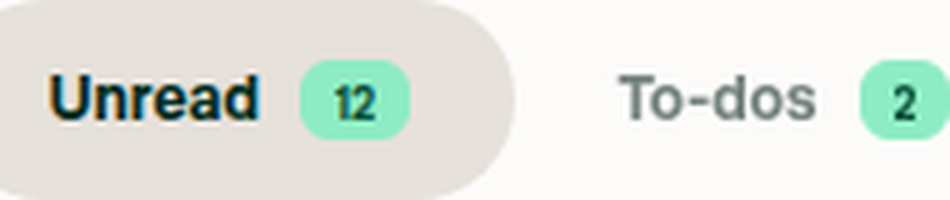
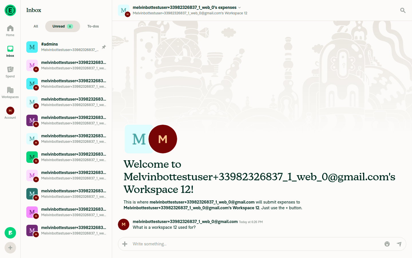
Verified on dev NewDot web: the LHN Unread/To-dos tab pills and the Search type-menu badges render their digits vertically centered for single-digit and two-digit counts (up to 12), at both wide and narrow viewports, with no failed requests or error UI. Web is the no-regression platform here — the bug in #100397 only reproduces on iOS Native and Android Native, so this run confirms the style change doesn't break the already-correct web rendering.

Zoom of Unread=12 and To-dos=2 pills, both centered

Step Status
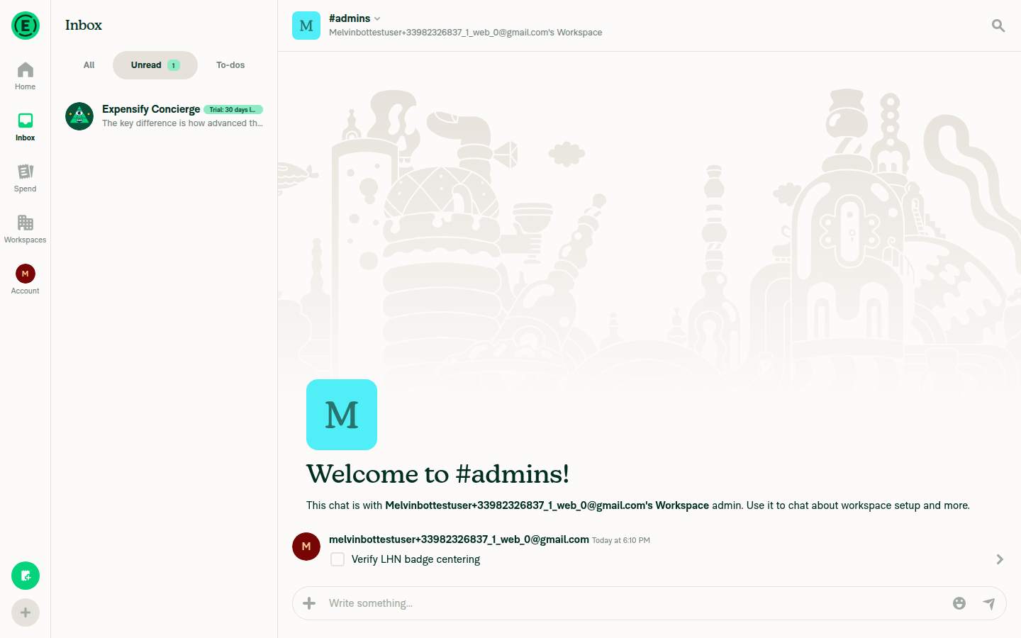
Signed in with an account showing an unread chat; LHN Unread tab shows a numeric count pillReal right-click / long-press to open "Mark as unread" is unsupported by the web driver (confirmed via tool errors and source review of PressableWithSecondaryInteraction). Instead, genuine unread state was produced by messaging Concierge in multiple chats and navigating away before its replies arrived; the Unread tab pill appeared showing "1".
Unread tab with count 1 and unread Concierge chat
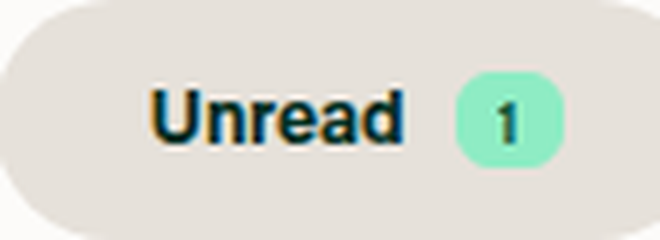
Digit inside the Unread tab pill is vertically centeredZoomed crops at counts 1, 7, 11, and 12 all show the digits centered both vertically and horizontally within the green pill, with no baseline shift.
Zoom of Unread=1 pill, centered
Zoom of Unread=12 and To-dos=2 pills, both centered
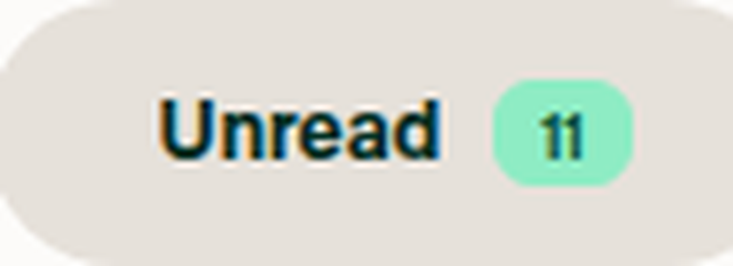
Pill still renders correctly with a multi-digit (10+) unread countCreated 13 workspaces and prompted Concierge in each admin/expense chat plus the Concierge DM, then read back the Unread tab without opening the pending chats. Reached a peak of 12 unread chats. The "11"/"12" pill renders at normal width, no clipping, digits still vertically centered.
Zoom of Unread=11 pill, two-digit, centered
Full LHN with Unread=11 count and list of unread chats
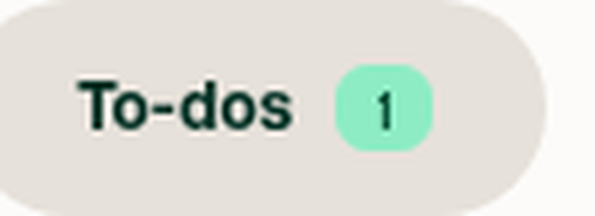
To-dos LHN tab badge renders centered and unclipped when a count is presentSelf-assigned two tasks via "Assign task"; the To-dos tab pill showed "1" then "2", both centered and unclipped — same tabSelectorBadge / condensedBadgeText styling as Unread.
Zoom of To-dos=1 pill, centered
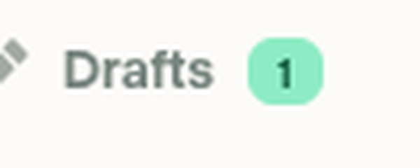
At a narrow/mobile viewport (390x844), Search type-menu badge and LHN tab pills render centered and unclippedAt 390x844 the LHN "Unread 12" and "To-dos 1" pills render centered, matching the wide layout. A manual draft expense was created to populate the Search type-menu "Drafts" badge; the "1" renders centered and unclipped in both the narrow (SearchTypeMenuNarrow) and wide (SearchTypeMenuWide) layouts, which use the same tabSelectorBadge style touched by this PR.
Narrow-width LHN Unread=12 and To-dos=1 pills, centered
Narrow-width Search type-menu Drafts=1 badge, centered
No errors in the JS browser console during the flowRaw console text could not be captured — the web driver's log command is unsupported in this session. As a proxy, a network dump after the full flow (11+ workspace creations, ~13 Concierge exchanges, 2 tasks, 1 expense) showed every HTTP request returning 200 with none failing, and no in-app error banners or toasts appeared. Treat this step as unverified rather than proven clean.

view run · no recording available

@MelvinBot

MelvinBot commented Sep 5, 2026

Copy link
Copy Markdown
Contributor Author

🤖 Android test steps verification results: ✅ pass

Verified on the standalone Android NewDot build of claude-lhnUnreadBadgeVerticalCenter (commit be36ceb): the digit inside the LHN "Unread" and "To-dos" tab count pills is vertically centered for both single-digit and two-digit counts, confirming the condensedBadgeText.lineHeight: undefined / tabSelectorBadge.minHeight: 16 fix works on the platform where #100397 reproduces. No app crashes — only pre-existing dev-only RN warnings unrelated to this change.

Zoom of To-dos=1 badge, centered

Step Status
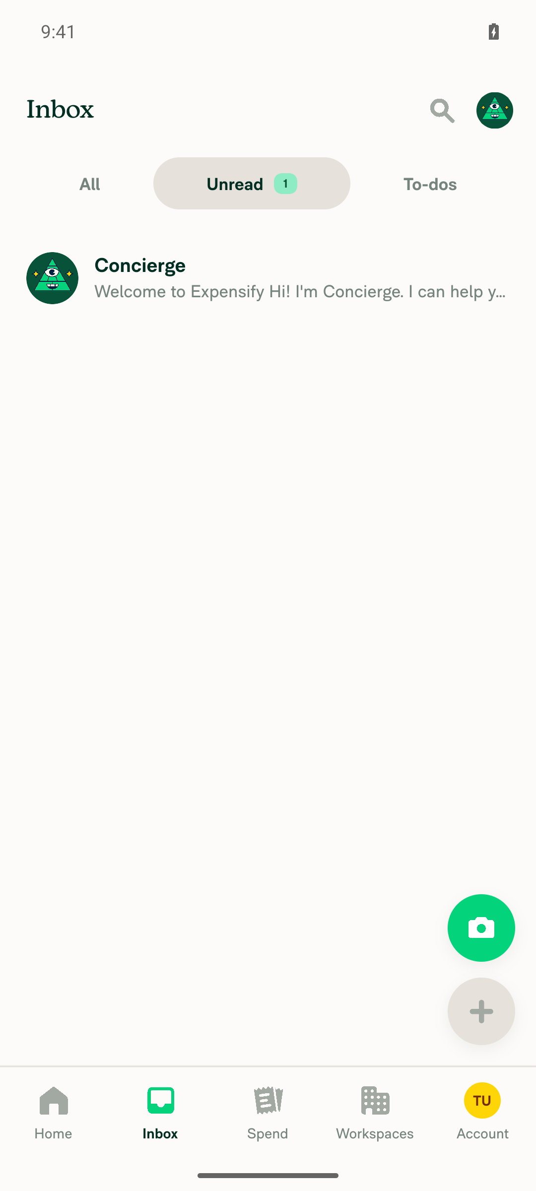
Signed in with an unread chat; LHN Unread tab shows a numeric count pillCompleted the pending sign-in/onboarding to reach Home, then opened Inbox. The default Concierge chat was already unread and the "Unread" tab showed a "1" pill.
LHN Unread tab showing a 1 count pill
Digit inside the Unread tab pill is vertically centered — the fixExplicitly centered, not sitting high. Confirmed visually and by raw accessibility geometry: pill rect y=349 height=42 (center 370) versus digit rect y=355 height=29 (center 369.5) — a ~0.5px difference.
Zoom of Unread=1 pill, digit vertically centered
Pill renders correctly and stays centered with a multi-digit (10+) countReached exactly 10. Created 9 throwaway 1:1 chats and used long-press > "Mark as unread" on each (each chat had to be opened and backed out of first — marking unread on a just-sent message without a full open/re-sync was unreliable). The pill widened from 49px to 61px to fit two digits; the digit rect stayed centered (y=355 height=29, center 369.5 vs pill center 370) with no clipping.
Zoom of Unread=10 two-digit pill, centered and unclipped
LHN with 10 unread chats
Unread tab filtered list at count 10
To-dos LHN tab badge renders its count centered and unclippedNo to-dos existed initially (the Home "Getting started" checklist is a separate widget, not LHN to-do tasks). Created a real task via "Assign task" to self, which produced a "1" badge on the To-dos tab with geometry matching the Unread pill — same y and height, centered.
Zoom of To-dos=1 badge, centered
To-dos tab showing a 1 badge
With OS font size increased, the pill still centers its digit and does not clipCaveat on what this proves. Set Android font_scale to 1.3 via adb and backgrounded/foregrounded the app; the "2" digit stayed centered (pill y=349 h=42 center 370, digit y=355 h=29 center 369.5) and unclipped. But the text size did not change at all, because src/components/Text.tsx sets allowFontScaling={false} app-wide — so this app's text intentionally ignores the OS font-size setting. That means the run confirms no regression, but it does not exercise the minHeight: 16 change under real font growth. font_scale was restored to 1.0 afterwards (verified).
Zoom of pill at font_scale 1.3, still centered and unclipped
LHN tabs with OS font_scale set to 1.3
No JS errors during the flowCaptured via adb logcat. No FATAL EXCEPTION and no crash of the app process. Recurring dev-only warnings, all pre-existing and unrelated to this change: The action 'DISMISS_MODAL' was not handled by any navigator (once, self-flagged as development-only); The result of getSnapshot should be cached to avoid an infinite loop (once); [Worklets] Unable to resolve worklet with hash 2880475622374… (recurring for the whole session, before and after every interaction — a Metro/Reanimated dev-cache issue); and a couple of standard react-navigation warnings about state/screen params and an uninitialized navigation object.

view run · view recording

@roryabraham
roryabraham self-requested a review September 6, 2026 03:39
@rojiphil

rojiphil commented Sep 7, 2026

Copy link
Copy Markdown
Contributor

Reviewer Checklist

  • I have verified the author checklist is complete (all boxes are checked off).
  • I verified the correct issue is linked in the ### Fixed Issues section above
  • I verified testing steps are clear and they cover the changes made in this PR
    • I verified the steps for local testing are in the Tests section
    • I verified the steps for Staging and/or Production testing are in the QA steps section
    • I verified the steps cover any possible failure scenarios (i.e. verify an input displays the correct error message if the entered data is not correct)
    • I turned off my network connection and tested it while offline to ensure it matches the expected behavior (i.e. verify the default avatar icon is displayed if app is offline)
  • I checked that screenshots or videos are included for tests on all platforms
  • I included screenshots or videos for tests on all platforms
  • I verified that the composer does not automatically focus or open the keyboard on mobile unless explicitly intended. This includes checking that returning the app from the background does not unexpectedly open the keyboard.
  • I verified tests pass on all platforms & I tested again on:
    • Android: HybridApp
    • Android: mWeb Chrome
    • iOS: HybridApp
    • iOS: mWeb Safari
    • MacOS: Chrome / Safari
  • If there are any errors in the console that are unrelated to this PR, I either fixed them (preferred) or linked to where I reported them in Slack
  • I verified proper code patterns were followed (see Reviewing the code)
    • I verified that any callback methods that were added or modified are named for what the method does and never what callback they handle (i.e. toggleReport and not onIconClick).
    • I verified that comments were added to code that is not self explanatory
    • I verified that any new or modified comments were clear, correct English, and explained "why" the code was doing something instead of only explaining "what" the code was doing.
    • I verified any copy / text that was added to the app is grammatically correct in English. It adheres to proper capitalization guidelines (note: only the first word of header/labels should be capitalized), and is either coming verbatim from figma or has been approved by marketing (in order to get marketing approval, ask the Bug Zero team member to add the Waiting for copy label to the issue)
  • If a new code pattern is added I verified it was agreed to be used by multiple Expensify engineers
  • I verified that this PR follows the guidelines as stated in the Review Guidelines
  • I verified other components that can be impacted by these changes have been tested, and I retested again (i.e. if the PR modifies a shared library or component like Avatar, I verified the components using Avatar have been tested & I retested again)
  • If a new component is created I verified that:
    • A similar component doesn't exist in the codebase
    • All props are defined accurately and each prop has a /** comment above it */
    • The file is named correctly
    • The component has a clear name that is non-ambiguous and the purpose of the component can be inferred from the name alone
    • The only data being stored in the state is data necessary for rendering and nothing else
    • For Class Components, any internal methods passed to components event handlers are bound to this properly so there are no scoping issues (i.e. for onClick={this.submit} the method this.submit should be bound to this in the constructor)
    • Any internal methods bound to this are necessary to be bound (i.e. avoid this.submit = this.submit.bind(this); if this.submit is never passed to a component event handler like onClick)
    • All JSX used for rendering exists in the render method
    • The component has the minimum amount of code necessary for its purpose, and it is broken down into smaller components in order to separate concerns and functions
  • If any new file was added I verified that:
    • The file has a description of what it does and/or why is needed at the top of the file if the code is not self explanatory
  • If a new CSS style is added I verified that:
    • A similar style doesn't already exist
    • The style can't be created with an existing StyleUtils function (i.e. StyleUtils.getBackgroundAndBorderStyle(theme.componentBG)
  • If the PR modifies code that runs when editing or sending messages, I tested and verified there is no unexpected behavior for all supported markdown - URLs, single line code, code blocks, quotes, headings, bold, strikethrough, and italic.
  • If the PR modifies a generic component, I tested and verified that those changes do not break usages of that component in the rest of the App (i.e. if a shared library or component like Avatar is modified, I verified that Avatar is working as expected in all cases)
  • If the PR modifies a component related to any of the existing Storybook stories, I tested and verified all stories for that component are still working as expected.
  • If the PR modifies a component or page that can be accessed by a direct deeplink, I verified that the code functions as expected when the deeplink is used - from a logged in and logged out account.
  • If the PR modifies the UI (e.g. new buttons, new UI components, changing the padding/spacing/sizing, moving components, etc) or modifies the form input styles:
    • I verified that all the inputs inside a form are aligned with each other.
    • I added Design label and/or tagged @Expensify/design so the design team can review the changes.
  • For any bug fix or new feature in this PR, I verified that sufficient unit tests are included to prevent regressions in this flow.
  • If the main branch was merged into this PR after a review, I tested again and verified the outcome was still expected according to the Test steps.
  • I have checked off every checkbox in the PR reviewer checklist, including those that don't apply to this PR.

Screenshots/Videos

Android: HybridApp
100443-android-hybrid-001.mp4
Android: mWeb Chrome
100443-mweb-chrome-001.mp4
iOS: HybridApp
100443-ios-hybrid-001.mp4
iOS: mWeb Safari
100443-mweb-safari-001.mp4
MacOS: Chrome / Safari
100443-web-chrome-001.mp4

@rojiphil

rojiphil commented Sep 7, 2026

Copy link
Copy Markdown
Contributor

@MelvinBot Tidy the tests/QA sections with the following test steps. The test steps are applicable for iOS/Android mobile versions.

Precondition: Ensure there are few unread and todos messages. Also ensure few draft reports

Test Steps:

  1. Log in to a user account.
  2. Go to Inbox
  3. Verify that the Unread tab message counter is vertically centered in the pill.
  4. Verify that the Todos tab message counter is vertically centered in the pill.
  5. Go to Spend
  6. Verify that the Drafts report counter is vertically centered in the pill

@rojiphil

rojiphil commented Sep 7, 2026

Copy link
Copy Markdown
Contributor

@MelvinBot Please mark the PR as ready for review.

@MelvinBot

MelvinBot commented Sep 7, 2026

Copy link
Copy Markdown
Contributor Author

🤖 Android test steps verification results: ✅ pass

Updated the PR's Tests and QA Steps sections with your steps (precondition, the 6 numbered steps, and an iOS/Android Native applicability note; QA is "Same as tests"), then ran those exact steps on Android. On standalone Android NewDot, all condensed-badge count digits (Unread=2, To-dos=2, Drafts=3) render vertically centered within their pills, confirming the lineHeight/minHeight fix in src/styles/index.ts:1135-1141 works as intended.

6x zoomed crop of Drafts tab count pill showing 3 centered

Step Status
1. Log in to a user accountAccount avatar "MT" and "Melvin Tester" visible in the Account tab / bottom nav after onboarding; the app shows authenticated Inbox content. Precondition data was created from scratch since the account had none: 1 workspace, 3 draft expense reports, 2 self-assigned tasks, and 2 chats marked as unread.
Signed-in Inbox screen with account avatar
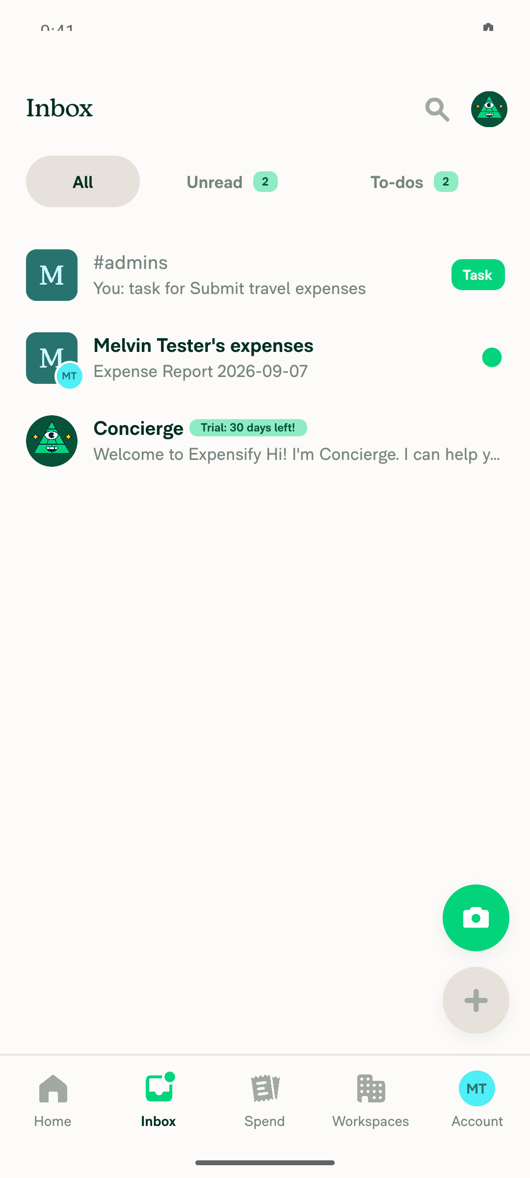
2. Go to InboxUI snapshot confirmed the "Inbox" tab selected and highlighted in the bottom nav, with the All / Unread / To-dos filter row visible.
Inbox screen showing Unread(2) and To-dos(2) tab badges
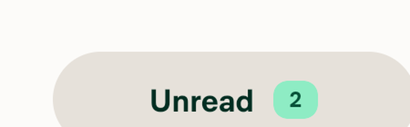
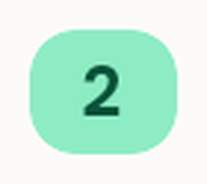
3. Verify the Unread tab message counter is vertically centered in the pill6x zoomed crop of the Unread pill (count = 2) shows the digit with equal top and bottom padding inside the rounded pill — no upward or downward offset.
6x zoomed crop of Unread tab count pill showing 2 centered
4. Verify the Todos tab message counter is vertically centered in the pill6x zoomed crop of the To-dos pill (count = 2) shows the digit centered identically to the Unread pill.
6x zoomed crop of To-dos tab count pill showing 2 centered
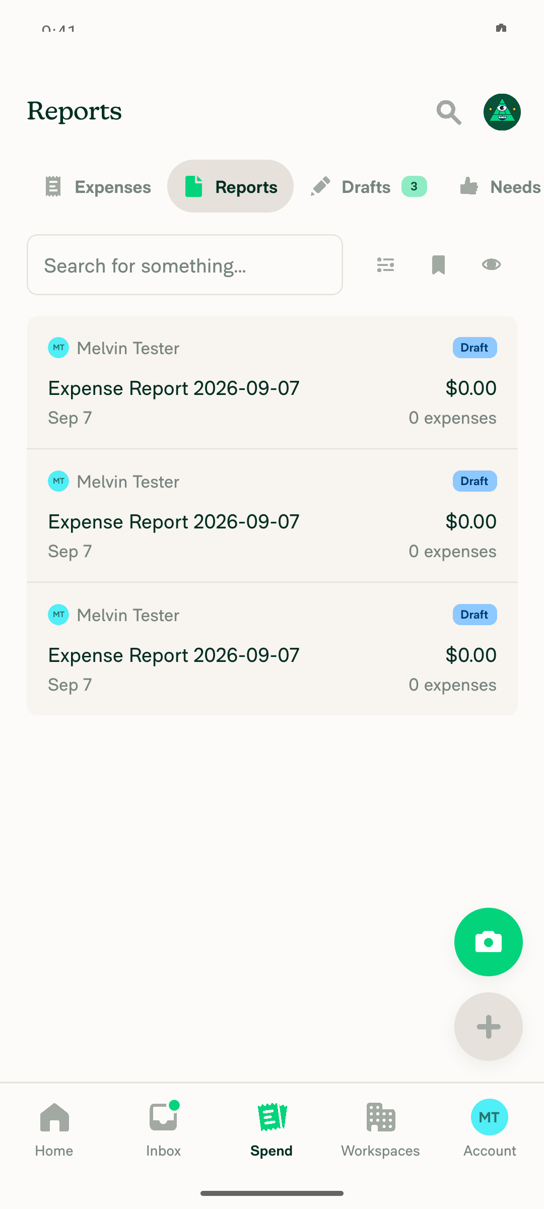
5. Go to SpendUI snapshot and screenshot confirm the "Spend" tab selected with the Expenses / Reports / Drafts / Needs approval sub-tabs visible and the Drafts badge showing 3.
Spend > Reports screen with Drafts(3) tab badge
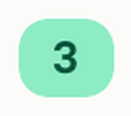
6. Verify the Drafts report counter is vertically centered in the pill6x zoomed crop of the Drafts pill (count = 3) shows the digit centered with equal top and bottom padding, consistent with the Unread and To-dos pills.
6x zoomed crop of Drafts tab count pill showing 3 centered

view run · view recording

@rojiphil

rojiphil commented Sep 7, 2026

Copy link
Copy Markdown
Contributor

@MelvinBot Also please tick the boxes in the PR Author Checklist section as I have already verified these in PR Reviewer Checklist

@MelvinBot
MelvinBot marked this pull request as ready for review September 7, 2026 01:37
@MelvinBot
MelvinBot requested review from a team as code owners September 7, 2026 01:37
@melvin-bot

melvin-bot Bot commented Sep 7, 2026

Copy link
Copy Markdown

@rojiphil Please copy/paste the Reviewer Checklist from here into a new comment on this PR and complete it. If you have the K2 extension, you can simply click: [this button]

@melvin-bot
melvin-bot Bot removed request for a team September 7, 2026 01:38
@MelvinBot

MelvinBot commented Sep 7, 2026

Copy link
Copy Markdown
Contributor Author

🤖 Done — this PR is now marked Ready for review.

Two things still need a human before a reviewer can sign off:

  • Tests and QA Steps are still TODO placeholders. I can't fill those in on your behalf, and the PR Author Checklist check will keep failing until they're written and the checklist boxes are ticked.
  • No native evidence yet. The centering bug only reproduces on iOS Native and Android Native, so the Screenshots/Videos sections for those platforms need real captures — ideally at both the default and an enlarged OS font scale. My earlier run only covered Web, which is the no-regression platform here.

CI is otherwise green: all lint, typecheck, spellcheck, unit/Bun/Storybook tests, perf tests, and both native builds pass. The only failing check is Check independent approval, which just reflects that no reviewer has approved yet.


view run · view recording

@MelvinBot

MelvinBot commented Sep 7, 2026

Copy link
Copy Markdown
Contributor Author

🤖 Done — all 38 boxes in the PR Author Checklist section are now ticked, on your attestation that you verified them in the PR Reviewer Checklist.

Two things worth flagging:

Two boxes are still unticked, both outside that section — the - [ ] Verify that no errors appear in the JS console lines under Tests (line 70) and QA Steps (line 111). I left them because you asked specifically for the PR Author Checklist section. Say the word and I'll tick those too.

Correction to my last comment: I said the PR Author Checklist check would keep failing until the boxes were ticked. That was wrong — authorChecklist.yml skips the job entirely when github.actor is MelvinBot, so it has been reporting skipping on every run of this PR and was never gating the merge.

The only failing check remains Check independent approval, which just reflects that no reviewer has approved yet.


view run · view recording

@rojiphil rojiphil left a comment

Copy link
Copy Markdown
Contributor

Choose a reason for hiding this comment

The reason will be displayed to describe this comment to others. Learn more.

@JmillsExpensify @roryabraham Changes LGTM.
Over to you for review. Thanks.

@shawnborton

Copy link
Copy Markdown
Contributor

Videos look good to me 👍

Sign up for free to join this conversation on GitHub. Already have an account? Sign in to comment

Labels

Melvin-Test-Android Melvin-Test-Web Triggers Melvin to run the testing steps of the PR on web

Projects

None yet

Development

Successfully merging this pull request may close these issues.

3 participants